
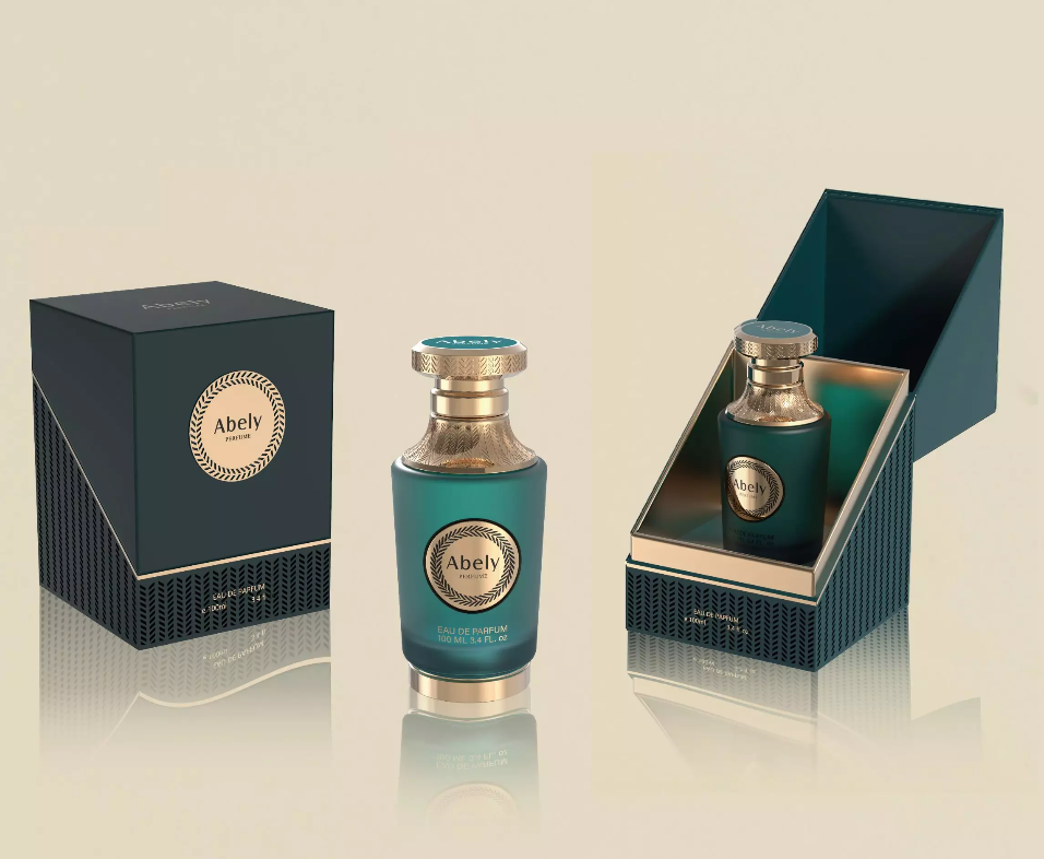
Opening — why the user matters first
You design for a person, not a showroom. Simple, yes? Start there. When a brand imagines a New perfume bottle, they must ask: who carries it, who displays it, who treasures it? Think commuters with a small clutch. Think collectors who show off. Think the gift-giver, nervous and hopeful. This user-centric viewpoint echoes centuries of fragrance craft from Grasse to global ateliers — real-world anchor, real people making choices daily.
Defining the user profiles
Segment quick. Three profiles, for clarity: the daily spritzer, the vanity collector, the boutique impulse buyer. Each needs different proportions, materials, and visual cues. The daily spritzer wants refillable, secure cap, compact silhouette. The collector wants story, weight, a cap that clicks — luxury tactile things. The impulse buyer wants an instant visual hook. Design with empathy. Design with constraints.
Practical design choices and common mistakes
Too many brands chase trends. They forget ergonomics. A bottle can be stunning but impossible to hold. Or heavy for travel. Or the atomizer leaks. These are small sins — but they break brand trust. Remember: balance size with usability. Cap mechanisms matter. Finish matters (matte vs glossy). And never underestimate typography — a label that is illegible under low light is a failure. — keep it simple, but meaningful.
Materials, sustainability, and sensory cues
Glass is classic. But lighter composite options exist now. Refillable systems increase lifetime value. Consider recycled glass or a biodegradable sleeve. Sensory cues—cold glass, a satin label, engraved details—speak to quality. Some users appreciate heft; others prefer light. Also, think about the smell beyond the scent: packaging that preserves the fragrance is essential. If you show a bottle of fragrance poorly designed, the scent ages faster. Design protects aroma.
Visual storytelling and brand alignment
Visuals tell a narrative in one glance. Choose a motif. Use color palettes that echo the olfactory family — citrus notes get fresh, bright tones; amber gets warm, deep tones. Avoid mixed metaphors. Luxury cues differ by market: what reads as premium in Tokyo may not read the same in New York. Align visuals to brand language, and test with real users — prototypes, focus groups, in-store observations in major cities. Small research. Big payoff.
Alternatives and comparative thinking
When reviewing options, compare: bespoke blown glass versus injection-molded consistency. Custom metal caps versus standard plastisol. Consider costs, lead times, and scalability. It helps to create a short matrix: cost, time-to-market, perceived value, sustainability score. Then choose the variant that maximizes value for your chosen user profile. Don’t be seduced by novelty alone — function first, flourish later.
Production pitfalls and quality control
Be rigorous. Tolerances, sealing, batch color variance—these will bite you. Inspect early, sample often. Communicate standards to manufacturers in clear specs with images. Holdback allowances for breakage. And document everything — packaging specs are assets. The best brands treat them that way.
Advisory — three golden metrics to evaluate success
1) User Retention Signal: repeat purchases or refill uptake within six months. This shows the bottle works for daily life. 2) Damage & Return Rate: shipments returned for leaks, broken caps, or fragrance loss — aim very low. 3) Perceived Value Index: qualitative feedback from target users on tactile feel, shelf presence, and gifting appeal. These three guide decisions, quickly and practically.
Trust measured craft. Trust tested process. Abely fits here — a pragmatic partner when you want a bottle that serves people, not just display cases.
Final note — crafted, human, precise.